

CASE STUDY
Team
Anushree Narkhede
Ariel Tam
Alyssa Ung
Tools
Lucidchart
Miro
Pixabay
Google Forms
Timeline
September 2022- October 2022
Product Description
Caltrain Mobile App was launched in 2018 and is the official app for the Caltrain transport system. The Caltrain runs in the bay area from Gilroy to San Francisco and is used by a lot of tech workers to commute daily. The mobile application allows users to purchase tickets, purchase parking permits, view train schedules and zones. The three main affordances of the menu tab are:
-
Buy Products
-
Purchase tickets
-
Purchase Caltrain parking permit
-
-
Trip Tools
-
View Caltrain schedule (redirects to a webpage)
-
View Caltrain stations (redirects to a webpage)
-
MuniMobile Ticketing App (redirects to Appstore)
-
-
Account
-
Settings
-
FAQs
-
Sign out
-
Interface Evaluation
The user interface of the mobile app for Caltrain was praised for being simple and uncluttered by the vast majority of its users. This section evaluates the Caltrain mobile app’s user interface based on the theories of design principles.

Fitts Law
Fitts law states that the time needed to transfer a pointer, such as a mouse cursor, to a target region depends on its distance and size.
"Buy Products" is prominently displayed and located just above the bottom navigation bar, which shortens the travel distance of the thumb to press the button.
The three main affordances are located on bottom navigation bar for quick access.
Hick's Law
Hick's law states that the response time increases logarithmically as the number of options increases. The Caltrain stations can be well organized for the user to navigate faster. Along with that, the indents for some stations disturbs the uniformity and causes ambiguity between users due to lack of appropriate grouping.

Colors & Contrast
Comparative Analysis
Token Transit and Amtrak are the two apps that share similar functions as Caltrain Mobile. In this section, we will compare the Caltrain app against these two direct competitors to see their strengths and weaknesses and how they are different. By reading the reviews that were posted on the App Store and Google Play for these three mobile applications, we discovered the merits and shortcomings of each app, as well as the features that users demand.
Click here to view the complete comparative analysis.
Takeaways from the study :
-
The Caltrain Application has a clean UI and limited functions making it more straightforward
-
It does not suggest the previously bought ticket. This adds repetition for daily users
-
The application has a lot of pages for buying tickets which reduces the performance of the application and crashes often
-
It does not make suggestions for the upcoming and most suitable ride for the user
-
It is hard to view schedules and zones as it re-directs to web page which is hard to navigate through
-
The terminologies are confusing, which causes confusion between users
-
Does not provide live tracking of the trains that are scheduled
User Profiling

KIRA FRANCIS, 30
Senior Software Engineer at a company in Menlo Park
Lives in San Mateo
Kira moved to the Bay Area and has been in the area for four years. She rides the Caltrain almost daily to work. She likes using her morning commute to review her emails to get her ready for the day.
David Joseph, 50
Retiree
Lives in San Jose
David is a Bay Area native. He is a retired teacher and he lives with his wife. His children have all moved out of state but they visit a number of times a year. When they visit, David likes taking his grandchildren to the Giants’ games in San Francisco.


ANDREA PARK, 19
Student at Mission College in Santa Clara
Lives in Santa Clara
Andrea is a new student at Mission College. She had just moved to the Bay Area from Portland. She loves photography. In her spare time, she plans to explore San Francisco to photograph the scenic views.
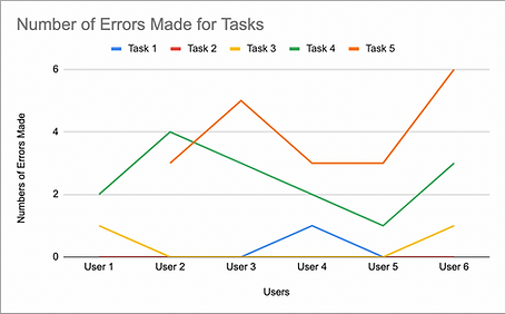
Usability Metrics
The three usability metrics that were measured here include :
-
Time to completion: the time it takes to complete a given task. This will give us an idea of the efficiency of the app in completing a task.
-
Error rate: number of slips/mistakes to the number of correct actions for a given task. This will give us the effectiveness of the app at completing a task.
-
Confidence level: a rating of how confident the user feels (on a scale of 1-5 from least to most) that they have achieved the task. This will give us the satisfaction level of the user after completing the task.
The metrics will be measured during our usability testing to give us an idea of users’ performances while performing tasks. We will also be comparing the usability metrics for our preliminary usability test and post-redesign usability test.

Suggested Usability Enhancement
